Ok

Ok

What is the question
Cancel
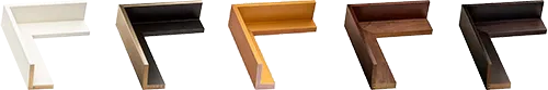
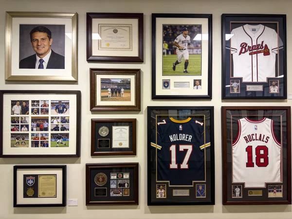
PICTURE FRAMES
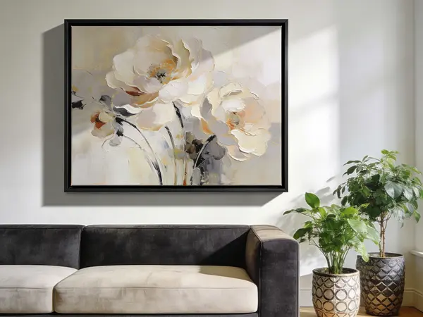 CUSTOM PICTURE FRAMES
CUSTOM PICTURE FRAMES
Design Your Framing Package Online!
Add Mats, Glass & Acrylic, Mounting Board And More.

Search
☰
My Account
Log In
Favorites
Saved Designs
Shopping Cart
Bottom Weight
Overview
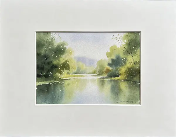
Bottom Weight refers to a matting design technique in picture framing where the bottom border of a mat is intentionally made wider than the top and side borders. This design choice is used to create a visually balanced presentation, particularly for framed artwork, photographs, or prints, making the piece appear centered to the eye even if the optical center of the artwork is slightly above the geometric center.
Purpose and Visual Effect
The concept of bottom weighting is based on human perception. Because viewers often perceive the optical center of a composition as slightly higher than its geometric center, a slightly wider bottom mat helps compensate for this visual bias. Key effects of bottom weighting include:
- Creating a sense of stability and grounding for the artwork
- Enhancing the overall aesthetic balance within the frame
- Providing additional space for captions, signatures, or titles at the bottom of the piece
- Helping to draw the viewer's eye naturally toward the center of the artwork
Implementation in Framing
Bottom weight can be applied to any mat configuration, including single mats, double mats, or Collage Mats. The width of the bottom border is typically slightly larger than the top border, ranging from an additional 1/4 inch (6 mm) to 1 inch (25 mm), depending on the size of the artwork and the desired visual effect.
Mat cutters and framing professionals often adjust bottom weight during the cutting process to achieve a harmonious balance. Some considerations include:
- The overall size of the mat and frame
- The proportions and composition of the artwork
- Viewer placement and expected viewing distance
- Style of the mat, such as French Mat or mats with a contrasting core like Black Core Mat
Design Considerations
- Artwork Size: Larger pieces may require proportionally more bottom weight to maintain visual balance.
- Mat Thickness: Using multiple mat layers can accentuate or reduce the visual effect of bottom weighting.
- Edge Treatments: Beveled or Reverse Bevel cuts can complement bottom-weighted mats, creating additional depth and sophistication.
- Style Consistency: Ensure bottom weighting aligns with the framing style and the aesthetic of surrounding elements (frames, glazing, and wall space).
Best Practices
- Always visually test the bottom weight effect before finalizing cuts.
- Maintain consistent spacing relative to the top and side borders to avoid appearing off-center.
- Consider using bottom weighting for artworks that include text, signatures, or titles at the bottom to improve legibility.
- Pair bottom-weighted mats with complementary mat styles, like French Mats or Collage Mats, for a professional presentation.