Ok

Ok

What is the question
Cancel
PICTURE FRAMES
 CUSTOM PICTURE FRAMES
CUSTOM PICTURE FRAMES
Design Your Framing Package Online!
Add Mats, Glass & Acrylic, Mounting Board And More.


Search
☰
My Account
Log In
Favorites
Saved Designs
Shopping Cart

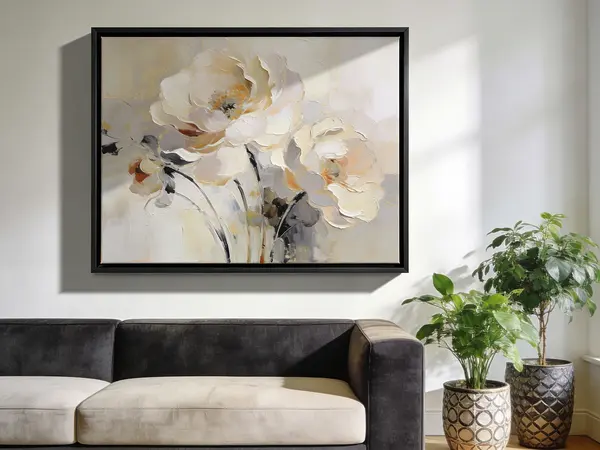
Almond Color
Definition: A soft, neutral beige color resembling the natural tone of almond shells. It is commonly found in earth-toned, monochromatic, or muted palettes such as Boho Chic or rustic interior schemes. In framing and d�cor, almond offers a versatile alternative to stark white or bold color, providing warmth without overpowering the artwork.
Overview
The almond color occupies a place between off-white and light tan on the color spectrum. Its muted quality makes it especially valued in interior design, as it harmonizes with both warm and cool tones. In framing, almond mats and mouldings provide a balanced backdrop that complements a wide range of artworks without drawing attention away from the subject.
Design Applications
- Neutral backdrops: Almond mats create a calming, subtle frame presentation for botanical prints, photography, and minimalist artworks.
- Warmth without dominance: Unlike stark whites, almond has a soft undertone that feels more natural and less clinical.
- Versatility: The color pairs well with wood mouldings, especially barnwood and country-style finishes.
- Bohemian palettes: Frequently used in Bohemian and eclectic interiors to unify earth tones and natural fibers such as jute, linen, or cotton.
Color Theory Context
Within the complementary color framework, almond functions as a muted neutral that bridges stronger color contrasts. It tempers vibrancy in warm reds, oranges, and ochres, while also providing a grounding base when paired with cool tones like teal or sage green. In monochromatic schemes, almond serves as a mid-tone between cream and deeper beige or taupe.
Framing Considerations
- Matboards: Almond mats are a classic choice for artworks featuring sepia tones, vintage photography, or natural subjects such as landscapes.
- Mouldings: Country or rustic mouldings with almond finishes are popular in farmhouse, shabby chic, and country picture frame designs.
- Conservation note: Framers should ensure almond mats are labeled "acid-free" or "archival" to avoid paper discoloration over time.
Common Misconceptions
- "Almond is the same as ivory." Ivory has cooler, creamier undertones, while almond leans slightly warmer and earthier.
- "Almond is only suited for rustic styles." In reality, almond integrates seamlessly into modern minimalist schemes, where it softens hard lines and bright whites.
Psychological Impact
Colors like almond are often associated with calm, warmth, and understated elegance. They are less formal than bright whites and less heavy than browns, making almond a comfortable middle ground in both framing and interior palettes.