Ok

Ok

What is the question
Cancel
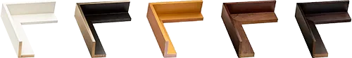
PICTURE FRAMES
 CUSTOM PICTURE FRAMES
CUSTOM PICTURE FRAMES
Design Your Framing Package Online!
Add Mats, Glass & Acrylic, Mounting Board And More.


Search
☰
My Account
Log In
Favorites
Saved Designs
Shopping Cart
Saturation
Overview
Saturation refers to the intensity, purity, or vividness of a color within a given hue. Highly saturated colors appear rich and vivid, while low saturation colors appear muted, washed out, or grayish. In art and design, understanding saturation is critical for creating visual impact, mood, and harmony in compositions.
Applications in Art and Framing
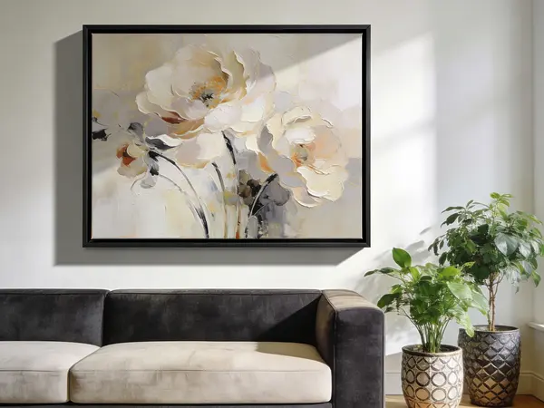
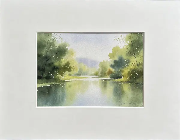
- Mat and Frame Selection: Choosing mats and frames with complementary saturation levels enhances artwork without overpowering it.
- Color Theory: Adjusting saturation can affect perception of depth, focus, and balance in a piece of art.
- Printing and Digital Imaging: Accurate control of saturation ensures faithful reproduction of artwork and photographs.
- Conservation Considerations: Faded or desaturated colors in artwork may indicate light damage or aging pigments.
Best Practices
- Use complementary saturation contrasts to draw attention to focal points in framed artwork.
- When framing colored prints or paintings, choose mat colors that either match or slightly reduce contrast in saturation to avoid visual clash.
- Monitor and control exposure to light to prevent unintended desaturation over time.