Ok

Ok

What is the question
Cancel
PICTURE FRAMES
 CUSTOM PICTURE FRAMES
CUSTOM PICTURE FRAMES
Design Your Framing Package Online!
Add Mats, Glass & Acrylic, Mounting Board And More.

Search
☰
My Account
Log In
Favorites
Saved Designs
Shopping Cart

Everything you need to know about choosing the right picture frame style for your artwork, including how to read the artwork itself, match frame styles to your decor, understand popular frame profiles, and avoid common design mistakes. Written for artists, photographers, galleries, and home decorators.
Why frame style matters
Frame style is more than decoration. It performs several important jobs:
- Traditional frames Protect your artwork by supporting mats, backing, and glazing.
- Directs your eye into the image instead of away from it.
- Connects the artwork to the style of the room where it hangs.
A good rule of thumb is that the frame should complement the art, not compete with it. When a frame grabs more attention than the artwork, it becomes harder to enjoy the image itself.
Key frame style ideas
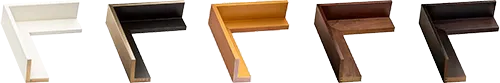
- Face width: the visible front edge of the frame.
- Profile: the shape of the frame when viewed from the side (flat, beveled, ornate, etc.).
- Finish: the color and surface treatment (natural wood, painted, distressed, metallic).
- Depth: how deep the frame needs to be for canvas, mats, and backing.
How to "read" your artwork
Before you look at physical frame samples, start by studying the piece you are framing. This is the most important step and will narrow your choices quickly.
Consider the medium
Different mediums tend to look best in certain frame families:
-
Photography and prints
Clean, simple frames keep the image in focus. Slim black, white, or metal profiles are common "gallery" choices. -
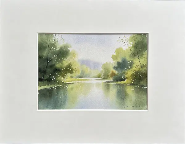
Watercolor and drawings on paper
Lighter wood tones and soft colors feel airy and subtle. Mats are usually recommended to give breathing room. -
Oil and acrylic paintings on canvas
Traditional wood frames can add richness and presence. Canvas floater frames are ideal when you want to show the painted edges. -
Posters and graphic art
Slim black or white frames create a modern look. Bright accent colors can work if they relate to the poster artwork.
Look at color and contrast
Frame color can either echo colors in the art or gently contrast with them:
- Echo one or two key colors from the artwork in the frame or mat.
- Use dark frames to add drama and depth around light artwork.
- Use light frames to keep bright or minimal artwork feeling open.
- Neutral frames (black, white, natural wood) are safe options when you are unsure.
Notice the mood
Ask yourself how the artwork feels:
- Calm, soft, or romantic pieces often pair well with simple, soft-toned frames.
- Bold, graphic, or edgy art can handle sharper profiles and stronger colors.
- Vintage or historical images may call for classic or slightly ornate frames.
Let the artwork lead. Once you understand what the piece is "saying," it is much easier to pick a frame style that supports that message.
Match the frame style to your room
Artwork never lives in isolation. The frame has to make sense with the room around it as well as with the artwork.
Things to consider
-
Wall color
A frame that is just a bit darker or lighter than the wall often looks intentional. White frames on white walls give a very minimal, clean look. -
Furniture and finishes
Echo woods (oak, walnut, cherry) or metals (black, brass, chrome, nickel) that already exist in the room. -
Room style
Traditional rooms often look right with classic profiles and warm finishes. Modern or minimal spaces favor clean profiles and simple colors. Rustic or farmhouse spaces do well with distressed woods and relaxed finishes. -
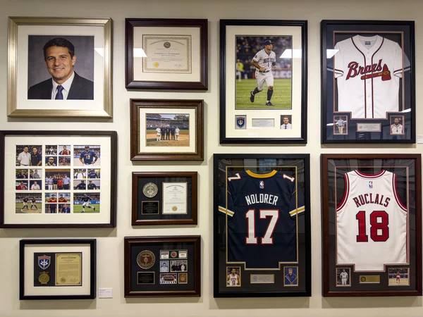
Other frames in the space
For a gallery wall, repeating one or two frame finishes keeps many different artworks looking cohesive. For a single focal piece, you can choose a slightly bolder frame as long as it still supports the art.
The art comes first, but the frame should also feel like it belongs where it will hang.
Popular frame styles and when to use them
Below are common frame style families and how they are typically used.
Simple gallery frames (slim, clean profiles)
Description
- Slim, flat or slightly rounded profile.
- Usually black, white, or natural wood.
Best for
- Photography, modern prints, posters, and contemporary drawings.
Why they work
- They are quiet and neutral, so the art stays in the spotlight.
- They mix easily in gallery walls and small collections.
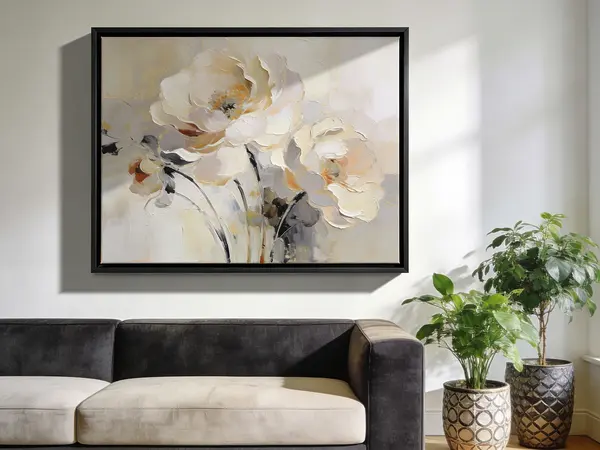
Traditional wood frames (classic profiles)
Description
- Curved, beveled, or stepped profiles.
- Warm stained woods or classic painted finishes.
Best for
- Portraits, landscapes, heritage photos, and traditional paintings.
Why they work
- They add formality and depth.
- They feel at home in classic or transitional interiors.
Ornate and decorative frames
Description
- Carved or molded detail, sometimes with gold or silver leaf.
- Heavier profiles that make the frame part of the statement.
Best for
- Formal portraits, historical pieces, statement mirrors, and richly detailed paintings.
Why they work
- They create a strong visual presence and a sense of luxury.
- They can tie into traditional or vintage decor themes.
Canvas floater frames
Description
- Designed for stretched canvas or wood panels.
- Creates a visible shadow gap so the art appears to "float" inside the frame.
Best for
- Modern paintings, abstracts, and photographs printed on canvas.
Why they work
- They show the entire painted edge of the canvas.
- They give a clean, gallery-ready look with minimal visual weight.
If you are framing canvas, explore our canvas floater frames and canvas board frames to see different profile and finish options.
Metal frames
Description
- Typically aluminum with slim, crisp profiles.
- Available in black, silver, gold, and color finishes.
Best for
- Contemporary artwork, posters, diplomas, office decor, and minimalist interiors.
Why they work
- They feel modern and clean, with strong lines.
- They can be very durable and lightweight, especially in larger sizes.
To compare classic wood and metal options, browse our natural wood picture frames and metal picture frames.
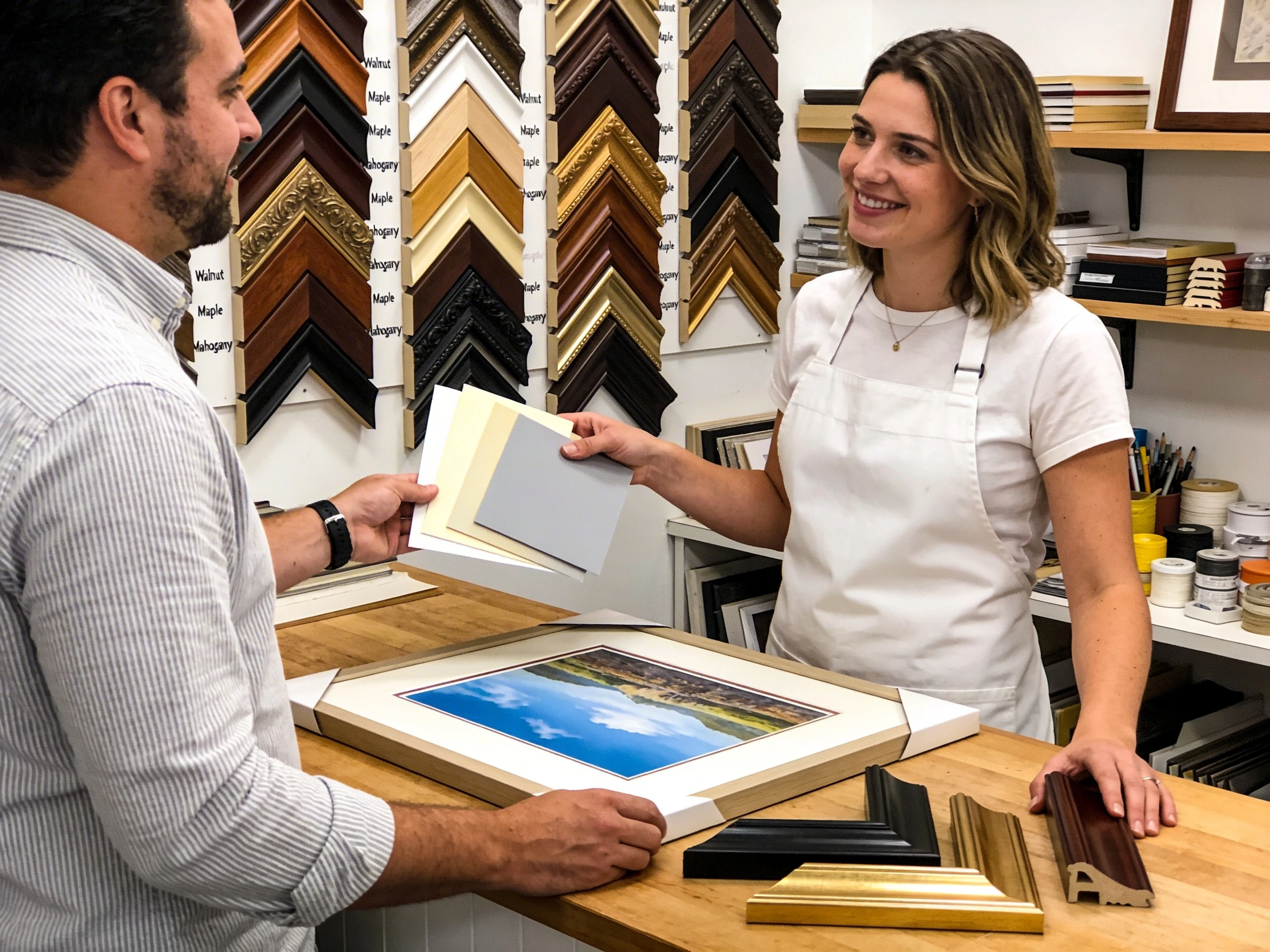
Mats, glazing, and how they affect style
Choosing a frame style goes hand in hand with decisions about mats and glazing (glass or acrylic). These choices affect both the look and the level of protection.
How mats change the look
- Single mats - clean and simple; great for photos and prints.
- Double or triple mats - add depth and a custom look by layering colors and reveals.
- Neutral mat colors - off-whites and soft grays rarely fight with the art and keep attention on the image.
The width of the mat changes the feel of the frame:
- Wider mats feel more formal and "gallery-like."
- Narrower mats feel casual and compact.
If you want to explore mat options, visit our custom mat design tool and picture mats overview.
Glazing and protection
- Glass or acrylic protects art on paper from dust, pollution, and physical contact.
- UV-filtering options can help slow fading and deterioration over time.
- Non-glare or reflection-control surfaces improve visibility in bright rooms.
- Museum or Optium protect and give your art an anti-reflective material that is superior to non-glare.
For works on paper, frame style, mats, and glazing all work together: the frame sets the overall style, the mat gives breathing room, and the glazing protects everything inside the frame.
Common mistakes to avoid
-
Frame style louder than the art
Extremely ornate or high-contrast frames can overpower subtle artwork. -
Frame color that clashes with the art or wall
If you notice the frame color before you notice the art, it might be too strong. -
Frame profile too heavy for small artwork
Very wide or deep frames can visually crush small pieces. -
No mat where one is needed
Photos and works on paper often need a mat for breathing room and to prevent contact with the glazing. -
Ignoring the room style
A frame that looks perfect in the shop might feel out of place at home if it does not match your decor. -
Mat borders are too small for the art
This is a common mistake with novice individuals. Good rule of thumb: If the frame width is less than 1 1/2 inch make mat borders 2 inches or more and if the frame is 2 inches or more make the mat borders at least 3/4 inch bigger. If you want to go smaller, only go smaller by 1/2 inch. -
Stripe framing
Avoid creating a design where the mats and frame are the same width.
Quick frame style decision checklist
Use this quick checklist before you place your order:
- Does the frame style match the mood and medium of the artwork?
- Does the frame color complement both the art and the wall where it will hang?
- Is the frame width in proportion to the size of the artwork?
- For canvas, have you considered a floater frame to show the edges?
- For works on paper, have you chosen the right mat width and color?
- Have you selected appropriate glazing (standard, UV, or non-glare)?
FAQ
Do all artworks need the same frame style?
No. You can mix frame styles within a home, but it helps to repeat certain finishes (like black metal or light oak) so the collection still feels intentional. Let each artwork guide its own frame choice.
What is the safest "default" frame style if I am unsure?
A slim black, white, or natural wood frame is a reliable starting point for many contemporary photos and prints. These frames are simple, clean, and unlikely to clash with most decor.
Should the frame match my decor or my art?
The art comes first, but the frame should also make sense in the room. Choose a frame that harmonizes with the artwork, then confirm that the finish works with your wall color and furniture.
Can I reframe a piece later if styles change?
Yes. Quality frames are designed so artwork can be reframed as tastes evolve or if you move to a new space. If you think you may reframe in the future, choose archival mats and mounting methods that are reversible.
Related resources
Next steps
Ready to choose a frame style that supports your artwork and fits your space?
Made in the USA
Handcrafted by American framing experts
Family Owned
Serving customers for over 40 years
Premium Shipping
Professionally packaged for safe delivery
Ready to Hang
Hardware included with all frames
Framing Specialists
Over 40 years of custom framing experience