
Ok

Ok

What is the question
Cancel
PICTURE FRAMES
 CUSTOM PICTURE FRAMES
CUSTOM PICTURE FRAMES
Design Your Framing Package Online!
Add Mats, Glass & Acrylic, Mounting Board And More.


Search
☰

My Account
Log In
Favorites
Saved Designs
Shopping Cart
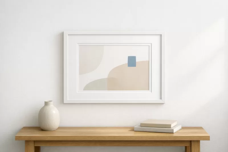
Custom White Wood Picture Frames
Shop custom white wood picture frames in bright white, matte white, ivory, off-white, cube, beveled, shadow-box, grooved, beaded, panel, and distressed directions made to your dimensions.
White profiles range from crisp and minimal to warm ivory, visible-grain, dimensional, and distressed. They can support photographs, portraits, posters, prints, puzzles, certificates, contemporary artwork, and coordinated gallery walls when the white relates to the paper, mat, and wall.
Filters
reset filters
SKU

Frame Colors
Frame Styles
Rabbet Depth
Frame Width
Frame Height
Manufacturers
16 Results
Sort:
Showing Prices For
6 x 8
Picture Frames
Enter your artwork size for exact pricing.
Artwork Width
Enter the Artwork exact width
Artwork Height
Enter the Artwork exact height
Enter the exact width and height of the artwork or picture you wish to frame; do not add extra space. We automatically add the industry-standard 1/8-inch allowance so your glass or canvas has room inside the frame for expansion and contraction.
View 6 x 8 Prices
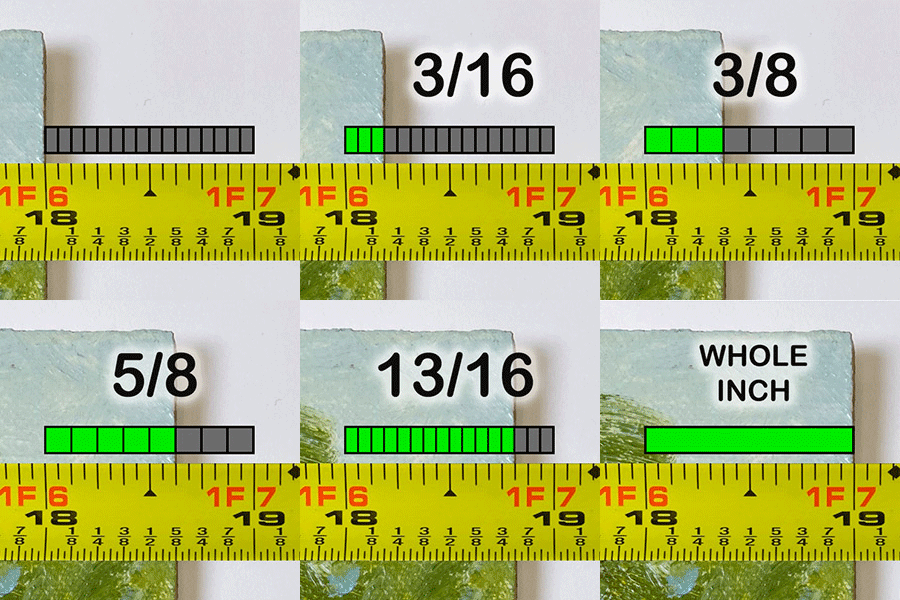
How to read your tape measure
v1385
$21.80
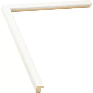
Width: 1/2 |
Rabbet Depth : 7/16
Flat white matte frame profile. This small white picture frame is so cute!.
V1626
$25.79
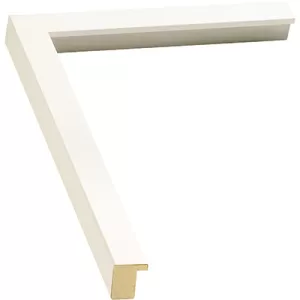
Width: 13/16 |
Rabbet Depth : 11/16
Simple, basic white frame profile is a popular choice for small to medium sized artwork. Although this basic white picture frame is less suitable for extra thick items, it might suit stretched canvases that are on shallow stretcher bars.
V685-1
$27.91

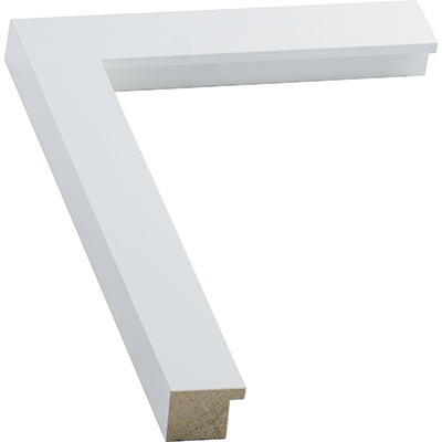
Width: 1 3/16 |
Rabbet Depth : 1/4
Smooth matte white contemporary frame profile profile for clean, modern displays. Designed for modern interiors, it delivers a clean edge that helps your image stand out without visual distraction.
V5033
$28.75
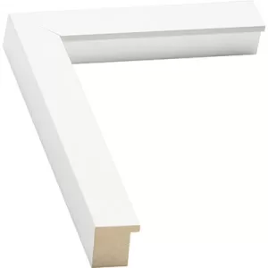
Width: 1 1/8 |
Rabbet Depth : 15/16
A simple white cube profile. Straight edges and a pale surface create a clean geometric outline.
V250
$26.07
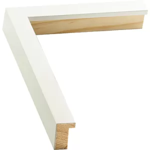
Width: 7/8 |
Rabbet Depth : 1
White frame profile. Great depth frame with a modern look for canvas paintings or matted fine art prints.
v568-1
$31.90
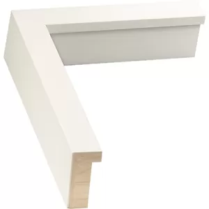
Width: 1 |
Rabbet Depth : 1 5/8
Suited for minimalist shadow box designs and deep canvas paintings. Black & white photography can really "pop" in a white frame, as do colorful paintings against a large white mat and white frame.
V252
$35.28
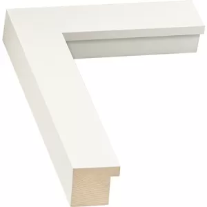
Width: 1 5/8 |
Rabbet Depth : 1
White cube shaped frame profile. Mat your pictures with a white mat and white frame, for an awesome gallery-style look.
V3995
$31.66
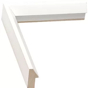
Width: 7/8 |
Rabbet Depth : 7/8
Contemporary medium wedge. Contemporary medium wedge white slated moulding.
V251
$35.78
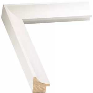
Width: 1 1/4 |
Rabbet Depth : 1/2
Great modern white frame profile style. Make it a white diploma frame to showcase your accomplishment, or preserve your children's art for years to come.
V455-1
$48.20
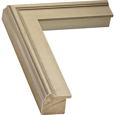
Width: 1 3/4 |
Rabbet Depth : 1
Frame profile with an ivory finish with a smooth look. This profile extends the Hudson range with a smooth ivory finish designed to complement classic interiors and curated gallery walls.
V594-1
$64.30
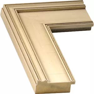
Width: 3 |
Rabbet Depth : 5/8
Off white antique style finish plein air frame profile. The restrained contour of Off White Plein Air Picture Frame creates a clear outline while allowing the artwork to remain visually dominant.
V123-1
$29.48
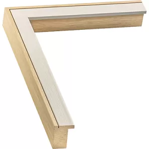
Width: 1 |
Rabbet Depth : 1
Two-toned white and natural wood profile with a modern, sleek, and refreshingly crisp look. The restrained contour of White Washed Wood Frame creates a clear outline while allowing the artwork to remain visually dominant.
V545-1
$35.44
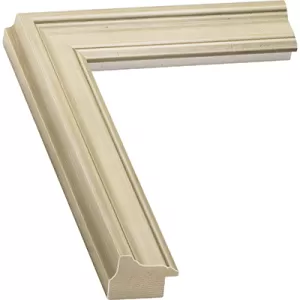
Width: 1 5/16 |
Rabbet Depth : 7/16
Ivory wood profile offers an refined metropolitan look. This ivory wood picture frame offers an refined metropolitan look that is inspired by the Hudson River School of painters, while staying relevant in a classic contemporary context.
V3949
$25.38
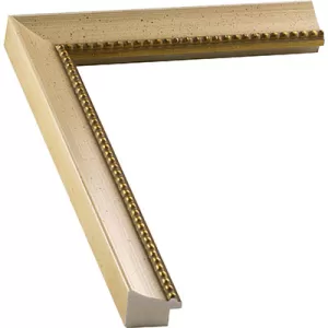
Width: 1 1/8 |
Rabbet Depth : 3/8
Ivory beaded wood profile. Family portraits, religious memorabilia, poetry, calligraphy, and foreign landscapes are interesting pairings with this ivory colored wood picture frame with a gold beaded lip.
v285
$43.33
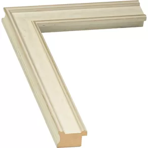
Width: 1 3/8 |
Rabbet Depth : 1/2
Traditional shaped white panel frame. White Panel Frame uses its particular finish and contour to establish a distinct boundary around the artwork.
V782
$25.48
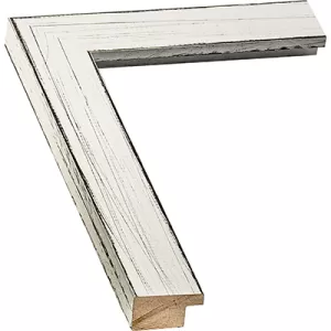
Width: 1 1/2 |
Rabbet Depth : 1/2
Rustic white frame profiles offer a country white vintage look. Order your rustic white frame in the size that's right for your art, whether you're framing prints, posters, photos, canvas, and more.
Choose white according to the project
| Project | How white can support it | What to compare |
|---|---|---|
| Photographs and portraits | Creates a light neutral boundary that can repeat highlights and pale backgrounds | Image whites, skin tones, mat color, finish warmth, and sheen |
| Posters and graphic prints | Keeps the border visually light around typography and saturated color | Paper color, margins, profile width, glazing, and wall contrast |
| Puzzles and illustrations | Provides a neutral edge without introducing another strong color | Dominant colors, outside dimensions, profile depth, and package thickness |
| Certificates and gallery walls | Creates a clean repeated framework for documents or mixed imagery | Visible details, mat openings, consistent profile, spacing, and wall color |
Compare bright white, ivory, and off-white
Bright white creates stronger contrast beside cream paper and warm walls. Ivory and off-white soften that transition. Matte and smooth finishes stay cleaner, while grain, distressing, grooves, beads, and panels introduce more surface character.
Coordinate mats, glazing, and package depth
Compare custom picture mats carefully because paper, matboard, and frame whites can differ in temperature. Review glass and acrylic options for paper artwork, then verify component fit with the rabbet depth guide. For project-first shopping, use wood picture frames for photos or wood poster frames.
Measure and examine the finish
Use the artwork measurement guide, enter the exact dimensions for current pricing, and order a sample to compare white temperature, sheen, texture, and profile shape.
White wood frame questions
What is the difference between white and ivory frames?
White generally reads cooler and brighter, while ivory and off-white introduce warmer undertones. Compare samples with the artwork paper, mat, and wall.
Can white frames work with colorful posters?
Yes. A white border can keep attention on saturated color and typography without adding another dominant hue.
How do I coordinate a white frame and white mat?
Compare their undertones directly. Two whites can look different when one is cooler, warmer, brighter, or more textured.
Why order a white moulding sample?
A sample shows the actual undertone, sheen, grain visibility, texture, and profile relief in your lighting.
Explore all custom wood picture frame collections to compare white with black, gray, natural, and colorful finishes.
Framing guidance reviewed by Web Picture Frames framing specialists. Last reviewed August 2026.
Made in the USA
Handcrafted by American framing experts
Family Owned
Serving customers for over 40 years
Premium Shipping
Professionally packaged for safe delivery
Ready to Hang
Hardware included with all frames
Framing Specialists
Over 40 years of custom framing experience