
Ok

Ok

What is the question
Cancel
PICTURE FRAMES
 CUSTOM PICTURE FRAMES
CUSTOM PICTURE FRAMES
Design Your Framing Package Online!
Add Mats, Glass & Acrylic, Mounting Board And More.


Search
☰

My Account
Log In
Favorites
Saved Designs
Shopping Cart
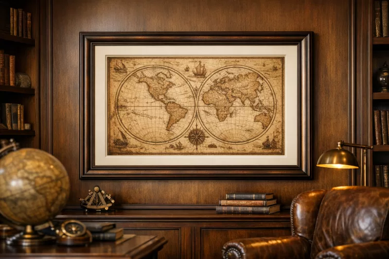
Custom Bronze and Copper Wood Picture Frames
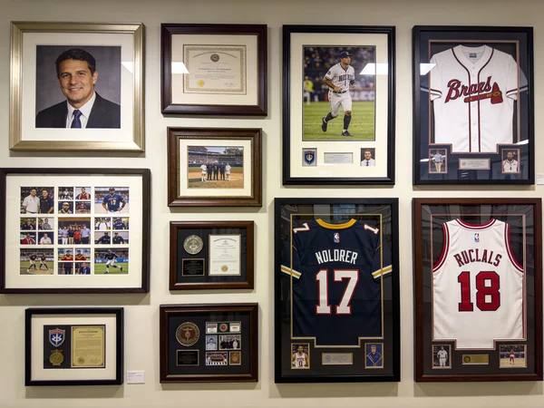
Frame maps, diplomas, certificates, awards, historic documents, drawings, etchings, landscapes, and warm-toned prints with custom bronze and copper wood picture frames made to your artwork dimensions.
Choose from reddish copper, brighter brass accents, deep bronze, and darker rubbed finishes on wood profiles. Compare the finish, profile shape, and current price, then order a sample to see how the color works with your project, matting, wall, and room lighting.
Filters
reset filters
SKU

Frame Colors
Frame Styles
Rabbet Depth
Frame Width
Frame Height
Manufacturers
9 Results
Sort:
Showing Prices For
14 x 18
Picture Frames
Enter your artwork size for exact pricing.
Artwork Width
Enter the Artwork exact width
Artwork Height
Enter the Artwork exact height
Enter the exact width and height of the artwork or picture you wish to frame; do not add extra space. We automatically add the industry-standard 1/8-inch allowance so your glass or canvas has room inside the frame for expansion and contraction.
View 14 x 18 Prices
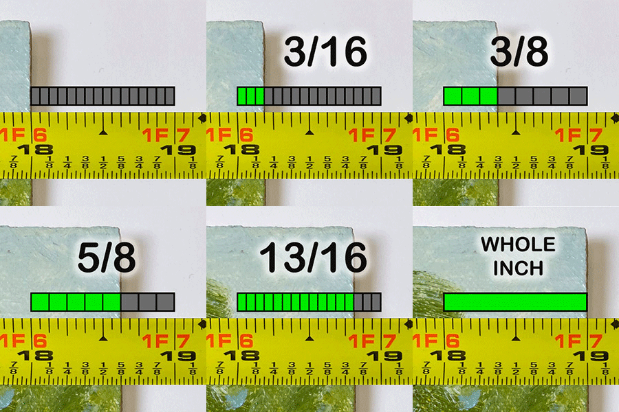
How to read your tape measure
V175
$58.01
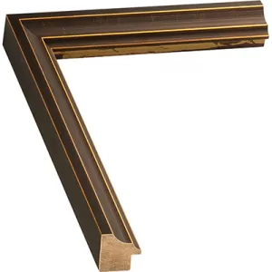
Width: 1 1/4 |
Rabbet Depth : 7/16
Oiled bronze with dark gold highlights and crackled broken leaf pattern frame profile. Oiled bronze photo frame for wall art and photography, with dark gold highlights & crackled broken leaf pattern picture frame.
V163
$91.26
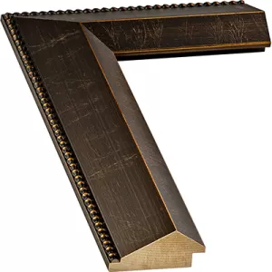
Width: 2 1/2 |
Rabbet Depth : 3/8
Oiled bronze beaded outer edge frame profile. The finish features coppery highlights under a chocolate brown aging wash, with "veins of gold" throughout the otherwise smooth beveled surfaces.
V174
$126.42
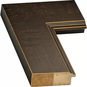
Width: 3 1/2 |
Rabbet Depth : 15/16
Oiled bronze with dark gold highlights and crackled broken leaf pattern frame profile. Oiled bronze picture frame with dark gold highlights & crackled broken leaf pattern over a wooden substrate.
V173
$158.81
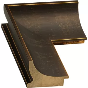
Width: 3 5/16 |
Rabbet Depth : 5/8
Oiled bronze deep scooped wood profile. The style of this bronze frame fits in several design settings, especially living spaces with warm tones that complement the copper undertones of this scooped wood picture frame.
V218
$105.93
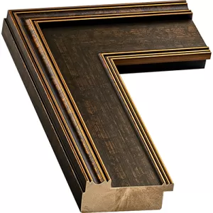
Width: 3 |
Rabbet Depth : 5/8
Classic, colonial-style, dark bronze frame profile. The finish has the appearance of oxidized bronze, but the substrate is solid wood.
V216
$146.03
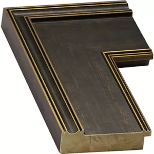
Width: 4 1/8 |
Rabbet Depth : 5/8
Large, dark bronze wood profile offers a traditional look. What is especially noteworthy about this dark bronze custom plein air picture frame is the large and substantial size, which provides a commanding and authoritative presence to both large and small paintings alike.
V194
$66.62
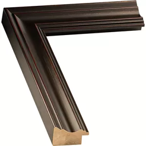
Width: 1 11/16 |
Rabbet Depth : 7/16
Subtle hints of red and olive green that creates silvery brown warmth. The unique and subtle coloring of this bronze wall picture frame is reminiscent of rocky highland grass and mountain landscapes, from Scotland to the hearty California coastline in winter.
V529
$62.17
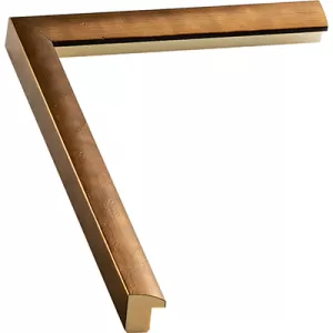
Width: 13/16 |
Rabbet Depth : 9/16
Contemporary, metallic, copper-colored frame profile. The brass finish on this wood copper-bronze frame features markings that resemble burst air pockets from molten metal that has solidified.
V282
$75.28
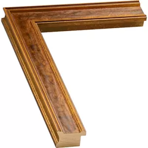
Width: 1 3/8 |
Rabbet Depth : 1/2
An antique-gold panel profile with a warm metallic face. The open center panel gives the warm metallic finish a broad, orderly presence.
What to frame with bronze and copper finishes
Bronze and copper finishes are often chosen for projects that benefit from warmth, depth, or an aged metallic character. The finish can reinforce the subject of the piece, connect with surrounding room details, or give an important document a more substantial visual border.
| Framing project | How the finish can support it | What to compare |
|---|---|---|
| Maps and charts | Bronze, copper, and dark rubbed finishes can connect with parchment colors, coastlines, route markings, and aged printing | Paper tone, line color, mat color, and whether the frame should appear lighter or darker than the map |
| Diplomas and certificates | A warm metallic-look border can give credentials a formal, established presentation | Document lettering, seals, matting, frame width, and the balance between brown and metallic color |
| Awards and recognition pieces | Bronze and brass accents can add warmth and visual emphasis around an achievement | The color of the award, surrounding text, mat layers, and how prominently the frame should appear |
| Historic documents and reproductions | Darker bronze and rubbed finishes can complement aged paper and muted printing | Paper condition, visible margins, glazing, mat color, and surface distressing |
| Drawings and etchings | Deep bronze can create a grounded boundary around fine lines and restrained palettes | Line weight, paper color, mat separation, and the amount of metallic highlight |
| Landscapes and warm-toned prints | Copper and bronze can repeat earth colors, reddish browns, ochres, and warm highlights | Dominant artwork colors, profile shape, finish temperature, and room lighting |
Choose the warm-metal finish direction
These are wood picture frame profiles with finishes that create bronze, copper, brass, dark brown, or rubbed metallic appearances. They are not solid bronze, copper, or brass frames.
A copper look generally reads warmer and more reddish-brown. Brass accents introduce a brighter golden note. Bronze combines warm brown and metallic character, while dark or rubbed bronze keeps the metallic effect more subdued.
Choose the direction according to the project. A map with warm parchment colors may connect naturally with copper or brass highlights, while a diploma with dark lettering may benefit from the stronger boundary of deep bronze. Awards and recognition pieces can use a brighter accent when the frame should carry more visual emphasis.
Use profile shape to control the presentation
A simply shaped bronze or copper profile keeps attention on the finish and the framed piece. Scoops and panels create broader transitions toward the image. Beads, grooves, raised edges, and distressed surfaces divide the finish into highlights and shadows.
Face width determines how much visual space the frame occupies, but width alone does not determine its impact. Compare it with profile relief, finish contrast, surface detail, mat width, and the scale of the map, document, award, or artwork.
Plan mats for maps, credentials, and artwork
A mat can provide visual separation, reveal a controlled border around a document, or add space for a layered presentation. Light neutrals can separate parchment, cream, and white paper from a dark bronze frame. Warmer neutral mats can connect with copper and brass finishes, while deeper mats create stronger contrast around lighter documents and prints.
For diplomas, certificates, and awards, confirm how much of the document must remain visible, including signatures, seals, borders, and printed details. Compare colors, materials, openings, and layered designs in custom picture mats.
You can also explore certificate and diploma framing options for additional credential-focused shopping paths.
Choose glazing for paper-based projects
Maps, diplomas, certificates, awards, drawings, etchings, historic documents, photographs, and paper prints are commonly presented behind glazing. Glazing becomes part of the total framing package and can affect weight, reflections, and the appearance of the finished design.
Review the available glass and acrylic options when building the presentation.
Check the complete package against the rabbet depth
The rabbet is the recessed space behind the frame lip. Its usable depth must accommodate the artwork or document and every selected component, which may include glazing, mats, spacers, mounting material, and backing.
Use the rabbet depth guide to see where this measurement is taken and how to compare it with the combined thickness of the framing package.
Compare bronze and copper with related finishes
Choose this collection when the project calls for a warm metallic appearance on a wood profile. If you want a quieter wood-colored direction without a prominent metallic effect, compare the brown picture frames. If you want a brighter and more consistently golden presentation, explore the gold picture frames.
Examine the finish beside the project
Warm metallic-look finishes respond to changes in light. Copper and brass areas may become more prominent under warm directional lighting, while dark bronze and rubbed surfaces can reveal different undertones as the viewing angle changes.
A moulding sample lets you inspect the actual color balance, sheen, texture, rubbed areas, and profile relief beside the map, diploma, award, print, artwork, mat selections, wall color, and nearby room finishes.
Price the frame for your project
Enter the exact width and height of the map, document, print, or artwork to see current pricing for a selected profile and design. When the piece is already matted or mounted, begin with the outside dimensions of that complete piece.
If you need help establishing the correct starting dimensions, follow the artwork measurement guide.
Bronze and copper wood picture frame questions
Are these frames made from solid bronze or copper?
No. This collection contains wood picture frame profiles with finishes that create bronze, copper, brass, dark brown, or rubbed metallic appearances.
Why use a bronze or copper frame for a map?
Bronze and copper finishes can connect visually with parchment colors, sepia printing, route markings, earth colors, and the aged character found in many maps and charts.
Can bronze frames be used for diplomas and certificates?
Yes. Bronze and brass-toned finishes can create a formal, warm border around diplomas and certificates. Compare the finish with the document lettering, seals, mat colors, and surrounding office or room finishes.
How should I frame an award or recognition piece?
Confirm the exact dimensions and all details that must remain visible. Then compare the frame finish, face width, mat opening, mat colors, glazing, and rabbet depth as parts of one complete presentation.
What is the difference between copper and bronze finishes?
Copper finishes commonly appear warmer and more reddish-brown. Bronze finishes generally read darker and browner, although the exact balance depends on the surface treatment, highlights, undertones, and lighting.
Why order a bronze or copper moulding sample?
A sample shows the actual finish color, undertones, sheen, texture, and profile relief beside the project and under the lighting where the finished frame will be displayed.
How do I know whether the framing package will fit?
Add the thickness of the artwork or document and every selected component, then compare that total with the usable rabbet depth listed for the moulding.
Explore all custom wood picture frame collections to compare bronze and copper with other colors, finishes, profile styles, and shopping options.
Framing guidance reviewed by Web Picture Frames framing specialists. Last reviewed August 2026.
Made in the USA
Handcrafted by American framing experts
Family Owned
Serving customers for over 40 years
Premium Shipping
Professionally packaged for safe delivery
Ready to Hang
Hardware included with all frames
Framing Specialists
Over 40 years of custom framing experience