Ok

Ok

What is the question
Cancel
PICTURE FRAMES
 CUSTOM PICTURE FRAMES
Design Your Framing Package Online!
Add Mats, Glass & Acrylic, Mounting Board And More.




Search
☰

My Account
Log In
Favorites
Saved Designs
Shopping Cart
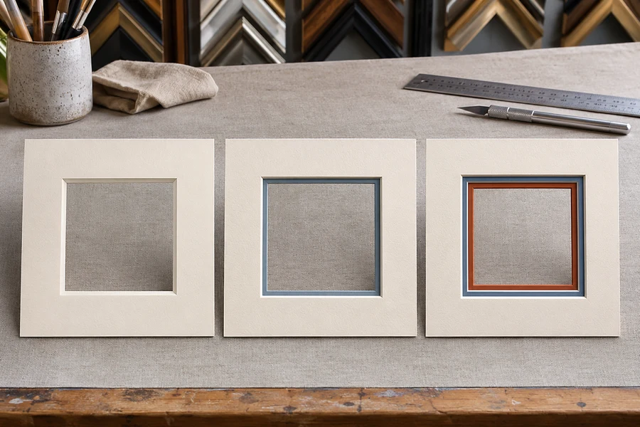
This guide builds a design one layer at a time, changing a broad red border into an accent reveal and then adding a third mat. Use that sequence to choose the amount of color you want around your image.
Watch: Single vs. Double vs. Triple Picture Mats
Compare the one-, two-, and three-layer designs
Liking a color does not necessarily mean you want a large border of it. A lower mat can introduce that color in a smaller amount.
Layer count and visible reveals
| Design | What changes with each layer |
|---|---|
| Single mat | A broad red mat surrounds the image, making red a large part of the presentation. |
| Double mat | A light top mat covers most of the red, leaving it as a narrower inner accent. |
| Triple mat | A dark top mat adds another color while leaving two lower layers visible at the opening. |
Adjust the reveal as well as the color
The reveal is the face of the lower mat visible inside the upper opening. Changing the amount of lower face revealed changes the strength of its color accent. The finished openings would be cut and aligned to create the selected reveal around the picture.
In the triple example, the two reveals differ in width. You can judge each accent separately; three layers do not require two identical bands of color.
Choose the least complicated design that gives the effect you want
- Start with a single mat and assess its color and border width.
- If a strong color dominates, try moving it to a lower layer with a smaller reveal.
- Add a third layer only if the extra accent contributes something useful to the image.
- Check the total package depth before fitting the layered mats into a frame.
For construction details, see single mats, double mats, and triple mats. Try the colors and reveals in the mat designer.
Choose the number of layers for a specific reason
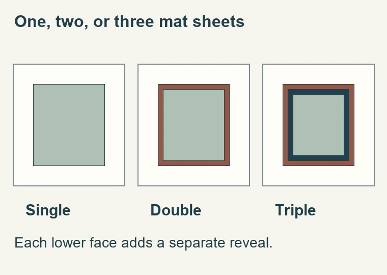
- Compare one, two, and three mat layers around the same presentation. Decide how many boundaries the image needs rather than choosing the construction that sounds more elaborate. A single mat gives the broad face and its window edge. A double mat adds one exposed lower face. A triple mat adds another exposed face. Each extra reveal can introduce color and another line around the artwork.
- The decision checks below supplement the examples. They are intended to help you compare designs with your own picture, not to make one layer count a universal recommendation. An image with an existing printed border may already have a strong boundary. Another image may benefit from a small color accent between a pale upper mat and the picture. Start with what the artwork needs and add a layer only when its visible contribution is useful.
- Layer count and opening count are separate choices. A single mat can have several windows, while a triple mat can surround one image. Likewise, face color and core color can create more than one visible tone in a single sheet. Count the physical layers rather than counting every line you can see at the bevel. That distinction helps when comparing samples and avoids ordering a construction different from the one you intended.
Assess the visual job of each construction
Single mat: one broad surrounding surface
A single mat is useful when the picture benefits from space but does not need an additional colored band. Its face occupies the whole border, so choose that face beside the artwork and intended moulding. The standard bevel may still create a contrasting core line. If that line is the only distracting detail, consider the edge treatment before assuming that an additional mat layer is the solution.
Double mat: a controlled inner accent
A double mat lets a lower face show through the upper window. This is a way to introduce a small amount of color without making the whole border that color. The width of the reveal matters as much as its name or hue. A narrow dark reveal may define the image edge; a wider one may become a pronounced colored band. Compare both before deciding that a particular color combination is right.
Triple mat: two visible lower reveals
A triple mat offers another layer of separation and another color relationship. It also gives the eye more boundaries to process. Check whether the second lower reveal adds something distinct from the first. If the two accents merge at viewing distance, or one repeatedly pulls attention away from the image, simplify or revise the design. More visible layers do not establish a better presentation by themselves.
Compare designs without changing everything at once
- Begin with a single upper mat color and border width that seem appropriate. Hold those constant while comparing a plain window with one lower reveal. Once the reason for that reveal is clear, test a third layer if needed. This sequence shows what each addition does. If you change the upper face, overall border, frame, and layer count together, it becomes difficult to identify which change actually improved the result.
- Use the actual artwork or an accurate physical sample whenever practical. A screen preview helps with layout, but the paper surface, core line, lighting, and frame finish should also be considered. Place corner samples against the image rather than judging them in isolation. View the picture upright and then step back to the distance at which it will usually be seen. Fine reveals can appear very different close up and across a room.
- Try reducing the design as a final test. Temporarily cover the lowest reveal or compare the plain single mat again. If the image becomes clearer without losing a useful relationship, the additional layer may not be needed. If removing it makes the transition feel abrupt, the layer has a recognizable purpose. This is a more practical decision than treating single, double, and triple mats as a fixed ranking of quality.
Specify windows, borders, and reveals separately
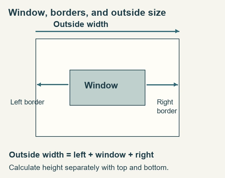
- The lowest opening establishes the visible artwork crop in a conventional overlapping arrangement. Upper openings are progressively larger to expose the intended lower bands. The outside dimensions of the layers must suit the final package. Write down those relationships rather than using the word 'double' or 'triple' as a complete instruction. Layer count tells the cutter how many sheets are involved, not which portion of each sheet should remain visible.
- Consider an illustrative double mat with a broad ivory upper face and a narrow blue lower reveal. Increasing the blue reveal changes the upper opening relative to the lower one. It does not automatically mean the final frame should receive a larger outside mat. Confirm how the designer defines border width and reveal width so that changing one control does not accidentally change the crop or total size you intended to keep.
- Unequal borders need the same care. Record left, right, top, and bottom dimensions, then specify whether the lower reveals remain equal around the image. A larger bottom border is a layout decision at the outside of the mat; it does not necessarily mean the visible lower color should be wider at the bottom. Clear separate measurements prevent a visual preference in one area from becoming an unintended change in another.
Check thickness and artwork-contact materials
- Every additional sheet adds to the package depth. Compare the actual mat stack together with glazing, artwork, backing, and any spacers against the frame's usable rabbet. A frame selected for a single mat may not accommodate the revised stack in the same way. Check the retaining arrangement too; it must suit where the back of the completed package sits relative to the frame.
- Verify the material specification of each board relevant to artwork contact and the intended preservation requirements. A lower mat does not become suitable simply because only a narrow edge is visible. Nor does a triple stack establish archival quality by its thickness. The board composition, artwork attachment, backing, and display conditions need their own assessment. Keep visual complexity separate from the properties needed to support and protect the work.
- Mat layers also do not replace a mounting method. Decide how the artwork will be located behind the lowest window and supported from the back. Avoid making the package so tight that pressure is doing the job of a suitable attachment. If the work needs a reversible arrangement, plan it explicitly. The visible layered border can be complete while an important part of the fitting remains unresolved behind it.
Review the design before ordering and fitting
- Confirm the visible artwork crop, margins, and signature area.
- List the layers from top to bottom, with the selected board for each.
- Record the upper border and each lower reveal independently.
- Check standard or reverse bevel preferences for the relevant openings.
- Confirm outside size, complete stack depth, backing, and retaining method.
- Compare the design with the intended frame at normal viewing distance.
When the mats arrive, place the layers together before attaching the artwork. Check the reveal widths, alignment, and corner cuts. Make sure the image remains where it belongs when the stack is seated in the frame. If a color band looks uneven, determine whether the layers are displaced or the openings differ from the order before trying to trim anything. The correction depends on the cause.
Keep the final layout record with the artwork dimensions. It will help if you later frame a related piece, replace a damaged mat, or explain a discrepancy to the supplier. A photograph of the finished frame is useful, but it may conceal the outside edges and actual board thicknesses. The documented construction provides the practical information needed to reproduce the design, beyond the shorthand description of single, double, or triple.
Made in the USA
Handcrafted by American framing experts
Family Owned
Serving customers for over 40 years
Premium Shipping
Professionally packaged for safe delivery
Ready to Hang
Hardware included with all frames
Framing Specialists
Over 40 years of custom framing experience