
Ok

Ok

What is the question
Cancel
PICTURE FRAMES
 CUSTOM PICTURE FRAMES
CUSTOM PICTURE FRAMES
Design Your Framing Package Online!
Add Mats, Glass & Acrylic, Mounting Board And More.


Search
☰

My Account
Log In
Favorites
Saved Designs
Shopping Cart
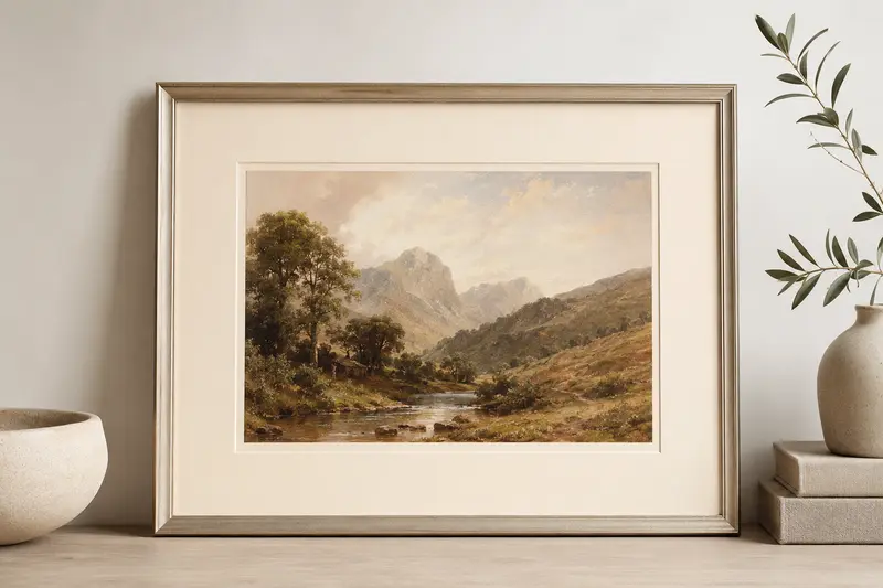
Custom Cream Picture Mats
Shop custom cream picture mats cut to size. Compare the color value, undertone, surface, core, and thickness, then specify the outside dimensions and opening needed for your artwork and frame.
Shop for Your Primary/Top Mat Color
Choose a cream mat to begin your design. It will initially appear as the primary/top mat, providing a softer, warmer transition than bright white.
Shop the cream mats below and select a color that complements your artwork.
Use it alone or as the primary/top layer of a double or triple mat.
Add narrow inner accent mats to repeat a color from the artwork, create contrast, or connect the design to the frame.
Your selection is only a starting point. You can change the primary/top mat, colors, dimensions, borders, and layers using our Custom Mat Designer.
Filters
reset filters
SKU

Color Sets
Mat Styles
Material
39 Results
Sort:
9805
Archival
from $7.05
Coconut Milk

Darker white relative to this grouping, but still translates as a neutral white.
9505
Archival
from $7.05
White Wash

Warm white neutral, soft alternative to our brighter 9500 White Glove.

9504
Archival
from $7.05
White Lie

Warm white nearly identical color to 9804 Pure White, but features a speckled surface.
9506
Archival
from $7.05
Egg White

Warm white perhaps a hint more yellow than actual egg whites.
9616
Archival
from $7.05
Honey Wheat

Creamy off white yellow tone, very similar to 9807 Off White
9508
Archival
from $7.05
White Sands

Creamy off white softer, less yellow, and lighter than 9616 Honey Wheat.
9507
Archival
from $7.05
White Elephant

Creamy off white Similar to White Sands 9508 but lighter.
9806
Archival
from $7.05
Dove

Creamy off white less yellow compared to others in this grouping; textured.

9615
Archival
from $7.05
Cream Puff

Creamy off white warm but not as yellow as other creamy off-whites.
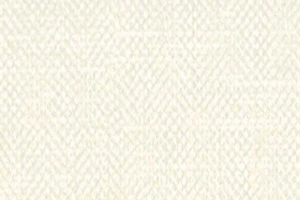















4840
Fabric Tier 2
from $35.62
White Silken

Classic ivory fabric mat with slight grain pattern variation
5533
Fabric Tier 1
from $26.25
Vintage White Linen

Standard neutral off-white fabric mat with a fine weave




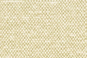
4410
Archival
from $7.05
Golden Samurai

Golden Samurai – Shimmering gold silken fabric mat




Cream Picture Mats Cut to Your Dimensions
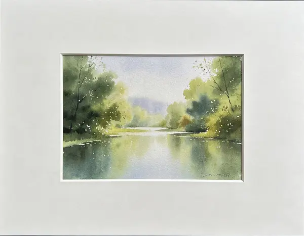
Cream picture mats provide a warmer alternative to bright white and often coordinate naturally with watercolor paper, aged documents, portraits, vintage prints, and wood frames. Compare ivory, warm white, beige-cream, textured, standard 4-ply, and deep-bevel 8-ply choices cut to your dimensions.
Every mat is cut to the measurements selected during ordering. Choose the outside size that fits the frame and the opening that controls how much artwork remains visible. Single, double, and triple mat designs can use cream as the primary border or as a controlled inner accent.
Light Ivory Mats
Pale ivory maintains a light neutral border while reducing the cool, crisp effect of a bright white mat.
Warm Cream Mats
Cream shades with yellow or golden undertones complement warm paper, sepia images, portraits, and traditional wood frames.
Beige-Cream Neutrals
Deeper natural neutrals create a softer bridge between cream paper, earth-tone artwork, and medium or dark wood molding.
Muted and Gray-Cream Mats
Subdued cream shades reduce yellow warmth and can suit weathered, antique, botanical, and quietly colored artwork.
Textured Cream Mats
Linen, silk, suede, and other surfaces reinforce the warmth while adding visible material character.
Deep-Bevel Cream Mats
8-ply cream and warm-neutral boards create a deeper opening edge for dimensional fine-art presentations.
How to Choose a Cream Mat Shade
Cream is not a single color. Compare whether the mat leans toward ivory, yellow, beige, gray, or peach, then place it beside both the artwork paper and the frame. The correct undertone should support the piece without making either the artwork or mat look unintentionally dirty.
View the choice as part of the complete design: artwork, mat or layered mats, frame finish, glazing, wall color, and room lighting. Screen previews are useful for narrowing the range, but they cannot provide a dependable final color match.
Best suited for: watercolors, drawings, portraits, botanical prints, vintage art, sepia photographs, documents, and artwork on warm or naturally colored paper.
Compare Custom Cream Picture Mat Options
Start with the value and undertone that support the artwork, then compare surface, core, thickness, and preservation level. The color family defines the general direction, but these material differences determine how the finished mat looks and performs.
| Cream mat type | Best use | Visual advantage | Important consideration |
|---|---|---|---|
| Light ivory | Watercolors, drawings, and natural paper | Light neutral without bright-white starkness | Can still contrast with deeply aged paper |
| Warm cream | Portraits, sepia images, traditional art | Supports golden and warm color relationships | May appear yellow beside cool artwork |
| Beige-cream | Earth tones, botanicals, rustic and traditional work | Bridges natural paper and wood frames | Adds more visible color than ivory |
| Gray-cream | Muted prints and weathered or antique palettes | Quiet warmth with less yellow | May appear dull beside saturated warm colors |
| Textured cream | Textiles, portraits, and refined traditional designs | Adds tactile richness | Surface and undertone need physical evaluation |
| 8-ply cream | Fine art needing warmth and deeper separation | Prominent dimensional bevel | Fewer shade choices and more frame depth required |
How to Size a Custom Cream Picture Mat
A correctly sized mat must fit both the artwork and the frame. Treat the outside dimensions and opening dimensions as separate measurements.
- Measure the artwork. Record its exact width and height and note any signature, border, deckled edge, text, or image detail that must remain visible.
- Choose the opening. The opening is normally slightly smaller than the artwork so the mat overlaps and retains its edges.
- Determine the outside size. The outside dimensions should fit the frame opening. Use the stated frame size or measure a mat that already fits.
- Review the border widths. Confirm that the top, sides, and bottom create the balance you want around the visible image.
- Confirm frame depth. Make sure the frame can hold the mat, artwork, glazing, mounting materials, and backing. Layered and 8-ply mats need additional depth.
Do not make the opening exactly equal to the artwork size unless exposed edges are intentional and another mounting method will support the art. A normal mat opening needs enough overlap to keep the artwork behind it.
Before ordering, see how to measure artwork for a custom picture mat for guidance on artwork dimensions, mat openings, and overlap.
Choose the Material, Core, and Mat Layers
Match the Preservation Need
Use archival mat board for photographs, prints, documents, and artwork you want to preserve. Choose museum board for especially valuable, original, historic, or irreplaceable pieces.
Compare Surface and Core
Smooth board keeps attention on the artwork. Fabric adds texture, while white core or black core changes the visible line along the beveled opening.
Add Layers Deliberately
A double or triple mat exposes narrow inner bands. Use those accents to repeat an artwork color, control contrast, or separate the top mat from the image.
Mat colors shown on a monitor are approximate. Order a physical sample when precise color, undertone, surface texture, or core appearance matters.
Picture Mat Guidance and Related Options
Use these resources to compare mat materials and nearby color families or continue building the custom framing package.
Custom Cream Picture Mat FAQ
What is the difference between cream, ivory, and warm white picture mats?
Warm white is usually the lightest and least yellow, ivory has a gentle warm cast, and cream is generally richer or more visibly warm. Manufacturer names vary, so a physical comparison is more reliable than the color name alone.
When is a cream picture mat better than white?
Cream is often more harmonious with naturally colored watercolor paper, aged documents, sepia photography, portraits, vintage prints, earth tones, and warm wood frames.
Can a cream mat make artwork look old-fashioned?
Not necessarily. Pale ivory and quiet cream can look clean and contemporary when paired with simple frames and restrained borders. Deeper yellow creams and ornate frames create a more traditional effect.
Are cream picture mats available in archival materials?
Yes. The collection can include conservation-quality and museum-quality choices as well as different surfaces and thicknesses. Check the selected mat's specifications for its preservation tier.
Can I combine cream with another mat color?
Yes. Cream works well as a top mat with a narrow inner mat drawn from the artwork, or as an inner accent beneath white, gray, brown, green, blue, or other coordinated colors.
Should I order a cream mat sample?
Yes when color relationship matters. Cream undertones vary considerably, and monitor color cannot reliably show how ivory, beige, yellow, gray, or peach influences will appear beside the artwork.
Made in the USA
Handcrafted by American framing experts
Family Owned
Serving customers for over 40 years
Premium Shipping
Professionally packaged for safe delivery
Ready to Hang
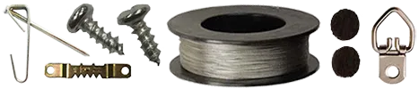
Hardware included with all frames
Framing Specialists
Over 40 years of custom framing experience