
Ok

Ok

What is the question
Cancel
PICTURE FRAMES
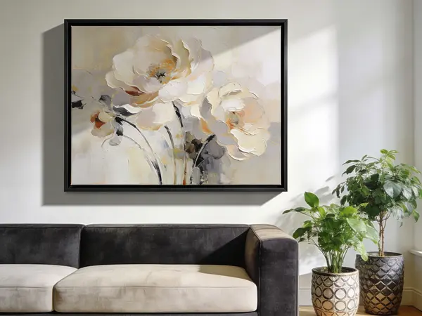 CUSTOM PICTURE FRAMES
CUSTOM PICTURE FRAMES
Design Your Framing Package Online!
Add Mats, Glass & Acrylic, Mounting Board And More.





Search
☰

My Account
Log In
Favorites
Saved Designs
Shopping Cart
Created by WebPictureFrames.com framing specialists, this guide explains how mat material, preservation quality, color, core, thickness, and layering affect both the appearance and long-term care of framed art.
Quick answer
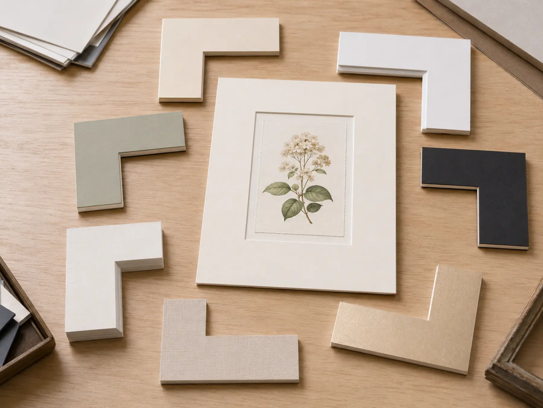
Start with the artwork's preservation needs, then make the visual choices. Use a preservation-grade board for original, valuable, sentimental, limited-edition, or irreplaceable work. Choose a mat color that supports a quiet tone in the artwork instead of competing with its strongest color. Select a white core for a light beveled line, a black core for a dark line, 4-ply for a classic profile, or 8-ply for a deeper bevel. Add a second mat only when its narrow reveal improves the transition between the artwork, top mat, and frame. Order physical samples when color or texture must be exact.
A useful order of decisions: preservation level, surface and color, core color, thickness, number of layers, then border and opening dimensions.
What a picture mat actually does
A picture mat is more than a colored border. It creates visual space around the image, helps control the transition from artwork to frame, and keeps the glazing away from most of the art surface. Its window also covers a small amount of the artwork or its mounting margin so the image remains securely presented.
The mat is part of the artwork's immediate environment. Its material matters whenever longevity matters, while its color, surface, bevel, thickness, and proportions determine how strongly it participates in the design.
Choose the material and preservation level first
Words such as acid-free, archival, conservation, and museum are often used loosely. Look at what the board is made from and what level of framing the manufacturer intends it to support.
Decorative paper mat board
A practical, economical choice for replaceable decorative art, temporary displays, posters, and projects where preservation is not the primary goal. Do not choose it solely because the surface paper is described as acid-free.
Conservation-grade mat board
Usually made with purified alpha-cellulose fibers and designed to reduce the contaminants associated with ordinary wood-pulp board. It is a strong default for quality framing, photographs, prints, and artwork expected to remain framed for years.
100 percent cotton museum board
Made from cotton fiber and selected for demanding preservation framing. It is appropriate for original, rare, valuable, historically important, or deeply sentimental artwork when the rest of the framing package is chosen to the same standard.
Specialty surface board
Fabric, metallic, black-core, and other decorative surfaces create distinct visual effects. Check the complete board specification separately; a special surface does not automatically tell you its preservation level.
Do not let the mat carry the entire preservation claim. Appropriate mounting, backing, glazing, spacing, handling, and environmental conditions also affect the artwork. For highly valuable or unusually sensitive work, consult a qualified conservator or preservation framer.
Choose a mat color that supports the artwork
Most successful mat colors are quieter than the artwork. Warm white, cool white, cream, gray, taupe, and other neutrals give the image room to remain dominant. A color can work well when it draws from a secondary tone already present in the art, but matching the brightest or strongest color often makes the border feel too assertive.
- Warm whites and creams tend to complement aged paper, earth tones, traditional prints, and warm wood frames.
- Bright or cool whites suit crisp photographs, contemporary graphics, and cooler palettes, but can make naturally aged paper look more yellow by comparison.
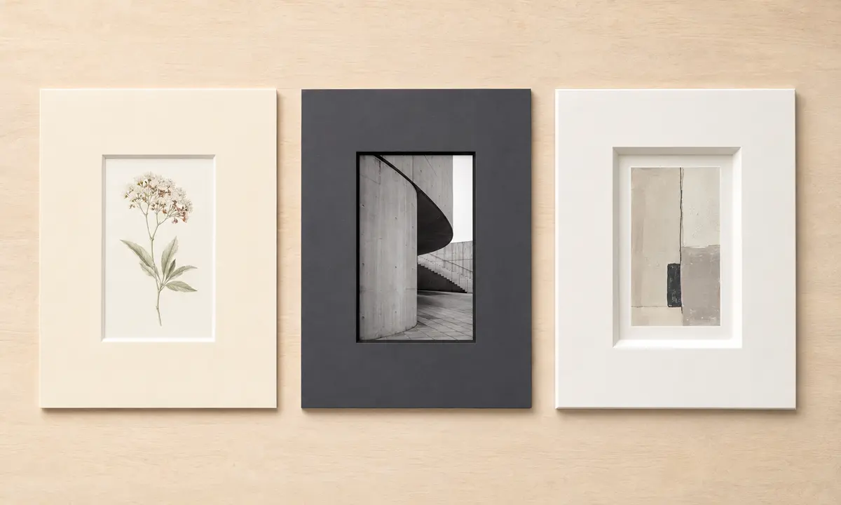
- Grays and charcoals can steady high-contrast photography and modern work without introducing a new hue.
- Muted colors can reinforce a secondary color in the art while remaining subordinate to the image.
- Dark top mats create weight and drama, but they can visually close in a small or delicate image.
Choose for the artwork first and the room second. Wall color and furnishings may change; a well-chosen mat should continue to make sense with the art.
If you are comparing several near-whites, see our guide to white picture mat shades.
Choose what the beveled core contributes
The angled cut around the opening exposes the board's core. That narrow line can subtly separate the image from the mat or become a deliberate design accent.
- White core: the most versatile choice. It creates a clean light line and usually keeps attention on the artwork.
- Black core: produces a dark outline without adding another mat layer. It can sharpen photography, typography, monochrome work, and bold contemporary art.
- Colored or specialty core: can create a distinctive edge, but should be judged as part of the full design rather than as a preservation indicator.
Core color and board quality are separate decisions. Confirm the material specification when preservation matters.
Choose 4-ply or 8-ply for the desired depth
A standard 4-ply mat provides the familiar narrow bevel seen in most professional framing. An 8-ply mat is approximately twice as thick and produces a deeper, more visible bevel with stronger shadow and dimensionality.
- Choose 4-ply for a classic, restrained presentation, layered mats, smaller artwork, or when available frame depth is limited.
- Choose 8-ply when a single mat should feel substantial, when a wide border needs more visual structure, or when contemporary and minimal artwork benefits from a deeper bevel.
Eight-ply is not automatically more archival than 4-ply. Thickness changes the appearance and spacing; fiber content and manufacturing determine the preservation category.
Consider fabric and metallic surfaces intentionally
Specialty surfaces are most effective when their texture or sheen has a clear relationship to the artwork and frame.
- Fabric mats add visible weave, softness, and depth. Linen-like neutrals can complement textiles, traditional works, certificates, portraits, and tactile natural subjects.
- Metallic mats reflect light and can connect with metallic inks, jewelry, instruments, awards, or a metal frame. A restrained reveal or narrow inner mat often works better than a large reflective field.
- Highly textured mats may create welcome richness around simple art but can compete with artwork that already contains fine texture or dense detail.
Texture and sheen change with viewing angle and room lighting, making physical samples especially useful for specialty boards.
Decide whether one, two, or three mats improve the design
- Single mat: clean, direct, and often the strongest choice. It gives the artwork breathing room without adding another color relationship.
- Double mat: exposes a narrow inner mat beneath the top mat. Use it to echo a secondary color, create a light or dark transition, or add depth.
- Triple mat: introduces another core, color, and bevel. It can suit formal, decorative, or highly structured designs, but every layer must earn its place.
Keep the lower reveal narrow enough to act as an accent. If the eye lands on the accent color before the image, reduce the reveal or choose a quieter color. The best mat design is not necessarily the most elaborate one.
Know when a physical sample is worth ordering
Screen brightness, display calibration, photography, room lighting, and nearby colors all change how mat board appears. Order samples when:
- you are selecting among warm white, cream, ivory, and bright white;
- the mat must coordinate with the artwork's paper tone;
- a muted color needs to match or support a specific passage in the art;
- you are considering fabric, metallic, or visibly textured board;
- you are framing valuable work or ordering multiple matching pieces; or
- a small color difference could change the entire design.
View samples beside the artwork under the lighting where the finished piece will usually hang. Evaluate them at normal viewing distance as well as close up.
Quick decision table
| Your priority | Start with | Then check |
|---|---|---|
| Valuable, original, or irreplaceable art | Conservation-grade or 100 percent cotton museum board | Compatible mounting, glazing, backing, and environment |
| Clean, versatile presentation | Neutral 4-ply white-core mat | Whether warm or cool white better supports the paper and image |
| Greater depth with minimal color | Single 8-ply mat | Frame rabbet depth and the deeper bevel's visual weight |
| Dark line around the artwork | Black-core mat | Whether the line strengthens the image without enclosing it |
| Subtle color accent | Double mat with a narrow lower reveal | A secondary artwork color rather than the dominant color |
| Visible texture or sheen | Fabric or metallic surface | A physical sample under the room's actual lighting |
| Economical decorative display | Decorative paper mat board | Whether future longevity or artwork value calls for an upgrade |
Common mat-selection mistakes to avoid
- Choosing by color before preservation: establish the board quality required by the artwork first.
- Treating "acid-free" as a complete specification: identify the board material and intended preservation category.
- Matching the room instead of the art: furnishings change more often than the framed piece.
- Matching the strongest artwork color exactly: the mat may compete with the focal point.
- Assuming thicker means safer: 8-ply changes depth; it does not define fiber quality.
- Adding layers without a purpose: every reveal introduces another line and color relationship.
- Relying on a screen for subtle color or texture: use samples for close decisions.
- Ignoring the complete frame package: mat layers, artwork, backing, glazing, and mounting must fit within the frame's available depth.
Frequently asked questions
What type of mat is best for valuable or irreplaceable artwork?
Choose a mat specifically manufactured for preservation framing, such as conservation-grade purified alpha-cellulose board or 100 percent cotton museum board. Confirm the complete specification rather than relying only on the phrase acid-free.
Is an 8-ply mat better than a 4-ply mat?
Not automatically. Eight-ply creates a deeper bevel and stronger visual depth. Four-ply has a quieter profile and works for most designs. Preservation quality depends on board material, not thickness alone.
Should the mat match the artwork or the room?
Let the artwork lead. A mat usually works best when it supports a quiet or secondary tone in the image. The room can influence the overall frame design, but wall color and furnishings should not control the mat choice.
Does a mat protect artwork from touching the glass?
A mat normally creates separation between the glazing and most of the artwork surface. Correct spacing depends on the complete assembly, artwork characteristics, mat thickness, mounting method, and frame depth.
When should I order mat samples?
Order samples whenever an exact white, neutral, fabric texture, metallic sheen, or subtle color relationship matters. Physical samples are the reliable way to judge color and surface under your own lighting.
Choose your next step
- Explore picture mats - compare custom-cut options and supporting resources.
- Design a custom picture mat - choose the size, opening, border, colors, and layers for your artwork.
- Order picture mat samples - compare physical color, texture, core, and sheen beside the artwork.
- Protect a paper print - review mounting, glazing, backing, and preservation choices beyond the mat itself.
Made in the USA
Handcrafted by American framing experts
Family Owned
Serving customers for over 40 years
Premium Shipping
Professionally packaged for safe delivery
Ready to Hang
Hardware included with all frames
Framing Specialists
Over 40 years of custom framing experience