Ok

Ok

What is the question
Cancel
PICTURE FRAMES
 CUSTOM PICTURE FRAMES
Design Your Framing Package Online!
Add Mats, Glass & Acrylic, Mounting Board And More.




Search
☰

My Account
Log In
Favorites
Saved Designs
Shopping Cart
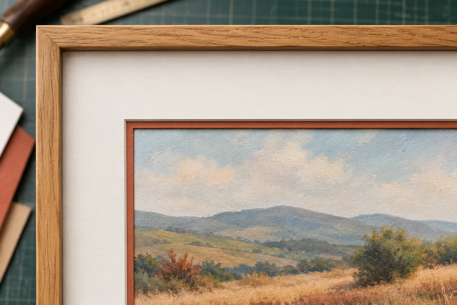
A double mat combines two window mats with different opening sizes. A narrow part of the lower mat remains visible inside the top opening, giving the image an accent border.
Watch: What Is a Double Picture Mat?
Two mats form one layered opening
A double mat can combine a white outer mat with a dark inner mat. The upper opening is larger, so a band of the lower mat remains visible around the image window. That band is the inner reveal.
Identify the top face, lower face, and fine cut edges separately when comparing colors. The bevel is the sloping cut through a sheet; the reveal is the visible face area of the lower sheet.
Specify the two-layer relationship
| Component | Purpose | Check |
|---|---|---|
| Upper mat | Supplies the broad surrounding face. | Its window must expose the intended lower band. |
| Lower mat | Supplies the inner face-color reveal and image window. | The crop must preserve the intended picture and margins. |
| Reveal | Shows the selected amount of lower face. | Record each side rather than relying on the word double. |
| Combined stack | Adds both sheets to the package. | Include the actual thickness with glazing and backing in the rabbet check. |
Choose the inner reveal deliberately
- Set the image crop with the innermost opening.
- Choose a main top-mat color for the broad border.
- Select the lower color and how much of it should show inside the top opening.
- Check the full composition rather than judging the accent as a loose color sample.
A narrow reveal can introduce a strong color without making it the whole border. A wider reveal gives the lower color more visual weight. Compare the options in the mat-layer comparison guide.
Account for both sheets when fitting
Two mat layers add thickness to the package. Check the combined glazing, mats, artwork, and backing against the frame's usable rabbet and retaining arrangement. A double mat describes the presentation; it does not by itself verify the protective properties of a particular mat material.
Use the measuring guide for opening and outside sizes, then choose the two colors and reveal in the custom mat designer.
Give the lower reveal a defined job
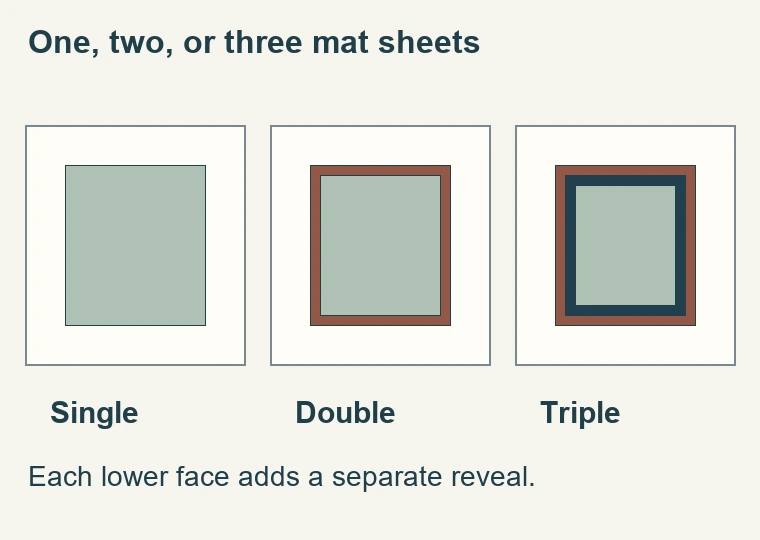
- A double mat is useful when a small amount of a second face color adds a clear boundary around the image. The upper mat provides the broad surrounding field; the lower mat supplies the narrower band visible through its window. This lets the design use an accent without making the entire border that color. Decide what the accent should accomplish before selecting it: separation, a connection to an image color, or a transition towards the frame.
- Specify the two-sheet construction with measurement, comparison, and fitting checks. It does not prescribe one reveal width or color combination for every image. Some artwork needs only the space provided by a single mat. A double mat should have a visible purpose when compared with that simpler version, rather than being selected automatically as a step up in quality.
- Look at the image's own boundaries. A printed white border, dark photographic edge, or line around an illustration already contributes to the transition. The lower reveal becomes another part of that sequence. Place samples over the actual work and check the result from the expected viewing distance. A band that looks restrained beside a loose corner sample may become a strong outline when it surrounds all four sides.
Keep the two openings and the outside size distinct
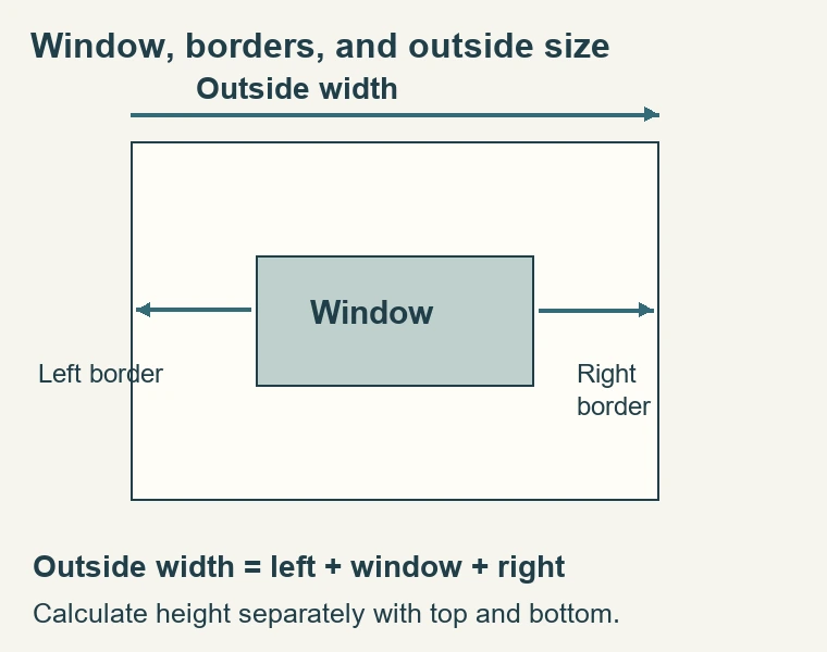
- The lower opening normally defines the visible crop in an overlapping double-mat arrangement. The upper opening is larger so the lower face shows around it. Both layers must also have outside dimensions suited to the complete package. That gives you three different relationships to communicate: the artwork window, the exposed lower band, and the outside size. The word double alone does not define any of those measurements.
- As an illustrative geometry example, an 8-by-10-inch lower window with a quarter-inch reveal on each side needs an upper opening half an inch larger in each overall direction: 8-1/2 by 10-1/2 inches. That describes the visible face relationship. It is not a cutting allowance or an instruction to alter the artwork overlap. Confirm the designer's measurement convention before using any example as an order.
- The broad upper border can be measured relative to its own opening or described as part of an overall design, depending on the ordering system. Check the labels in the current designer rather than assuming how a border control interacts with the reveal. After changing a reveal, review the stated outside dimensions and the visible crop. A useful preview should confirm which values stayed fixed and which values changed.
Choose the accent with a controlled comparison
- Begin with an upper face that works with the picture and frame. Keep that face and its broad border consistent while comparing lower colors. This isolates the accent decision. A dark reveal may sharpen the image boundary; a lighter one may soften a transition; a color drawn from the image may connect the inner and outer parts of the presentation. These are effects to assess with the work, not rules attached to particular color names.
- Then compare the reveal width. A narrow band and a wider band of the same board can have very different visual weight. The wider version exposes more color and moves the upper opening farther from the image. If the accent competes with the artwork, test a smaller reveal or a less contrasting face. Do not change the image crop merely to make an over-prominent accent seem less noticeable.
- Include the frame corner in the test. A reveal can relate to the moulding finish, but matching the finish is not mandatory and may not suit the artwork. Check whether the design leads the eye towards the image or creates a series of competing borders. Step back and compare it with the plain single mat again. That final comparison helps confirm that the additional layer is contributing something you can identify.
Evaluate both bevels and both board specifications
- Each sheet has its own window edge. A standard bevel can expose a core line that differs from the face color, so a double mat can show more than two tones. Decide whether those lines support the composition. A reverse bevel may change the prominence of a particular edge, but it does not remove the lower face-color reveal. Specify which opening receives which treatment rather than asking for an ambiguous 'reverse double mat.'
- Verify the material properties of the actual boards. The lower layer is close to the artwork, and the package may have preservation requirements that involve more than its visible face. Do not assume that a thin accent band is exempt from artwork-contact considerations. Color, thickness, and layer count do not establish archival suitability. Record the selected board for each layer rather than relying on a general statement that the mats should be conservation quality.
- Check thickness separately from appearance. Two sheets add more depth than one sheet of the same board, and the frame must still receive glazing, artwork, backing, and any other required components. A successful front design can fail the physical fit if the rabbet was chosen without the complete stack. Confirm that fit before ordering a narrow or shallow moulding whose appearance you do not want to change later.
Check alignment before attaching the artwork
- Lay the two mats together on a clean surface and align their outside edges as intended. Inspect the lower reveal on every side. If it looks uneven, determine whether the sheets have shifted or the openings were cut differently from the specified layout. Do not trim an edge until you know which dimension is responsible. A correctly cut pair can appear wrong simply because one layer is not seated in its proper position.
- Place the combined mats over the artwork and confirm the visible crop, margins, signature, and important edge detail. Check the corners as well as the centers of the sides. The upper face can distract from a small crop error at the lower window, especially when the accent color is strong. Inspect with the artwork in its final orientation before completing the mounting arrangement.
- Plan how the work is attached and supported behind the lower sheet. The mat stack defines the presentation but is not automatically a mounting system. Use materials and an attachment method appropriate to the artwork and any need for future removal. Do not depend on compressing the whole package tightly enough to prevent movement. Fit the glazing and backing, then retain the package without distorting its layers.
Double-mat order and fitting checklist
- Record the lower window that defines the intended image crop.
- Specify the upper and lower boards in their correct order.
- State the desired lower reveal on each side.
- Confirm outside dimensions and all unequal-border decisions.
- Identify the bevel treatment for each visible opening.
- Check the complete package depth and retaining arrangement.
- Inspect the loose stack, then inspect it again after fitting.
For multiple pictures, decide whether consistent outside sizes or consistent borders are more important. Different image sizes can require different border widths to share one outside frame size. A common lower reveal may still tie the designs together. Write each layout separately so the attempt to create a coordinated set does not accidentally change a picture's crop or cover a signature.
If a finished double mat later needs replacement, use the original measurements where available. The visible front of a framed piece may conceal the outside edges and does not reveal every construction detail. Keep the board selections, lower window, upper opening or reveal, outside size, and bevel preferences together. That record helps reproduce the design accurately and makes troubleshooting far easier than working from a color description alone.
A double mat is complete when the lower band has the intended width and purpose, the image remains correctly displayed, and the entire package fits. If an additional color is still desired, compare a triple construction deliberately. Avoid adding a third sheet to correct a measuring or alignment problem in the two-sheet design. Resolve the existing relationship first, then decide whether another visible boundary is justified.
Made in the USA
Handcrafted by American framing experts
Family Owned
Serving customers for over 40 years
Premium Shipping
Professionally packaged for safe delivery
Ready to Hang
Hardware included with all frames
Framing Specialists
Over 40 years of custom framing experience